【matplotlib】左右に軸があるグラフを描く
今回は、matplotlibで左右に軸があるグラフを作成します。
実行環境
- Windows10 WSL:Ubuntu
- Anaconda
- VScodeでjupyter拡張
- Python3.8
- 外部ライブラリ
- pandas 1.1.3、matplotlib 3.3.2
- 使用データファイル
バージョン確認しておきます。
import platform
print("OS :", platform.platform())
!anaconda -V
!conda -V
print("\nVCcode :")
!code --version
print("")
!python -V

import pandas as pd
import matplotlib
print("pandas :", pd.__version__)
print("matplotlib :", matplotlib.__version__)
OS : Linux-4.4.0-18362-Microsoft-x86_64-with-glibc2.10
anaconda Command line client (version 1.7.2)
conda 4.9.2

VScode :
1.54.1
f30a9b73e8ffc278e71575118b6bf568f04587c8
x64

Python 3.8.5
pandas : 1.1.3
matplotlib : 3.3.2
ライブラリのインストールは
$ pip install pandas matplotlib
など環境に合わせて行っておきます。
データファイルの入手
下のコードを実行すると、厚生労働省オープンデータからダウンロードし、作業ディレクトリに保存します。
URLs = ["https://www.mhlw.go.jp/content/pcr_positive_daily.csv", # 陽性者数 (厚生労働省 オープンデータ)
    "https://www.mhlw.go.jp/content/pcr_tested_daily.csv"] # PCR検査実施人数 (厚生労働省 オープンデータ)

# ダウンロード保存
for URL in URLs:
    #保存名(元ファイル名で)
    savename = URL.split('/') [-1]
    # 厚労省サイトから読み込み
    df = pd.read_csv(URL)
    #作業ディレクトリに保存
    df.to_csv(savebname, index=False)
データフレームに読込、2つを結合する
元のファイルはそれぞれ「日付」と「PCR陽性者数」、「日付」と「PCR検査実施件」の2列ずつになっています。
「日付」列をインデックスとしてそれぞれ読み込み、pd.merge()でインデックス(日付)を基準に結合します。
2ファイルは行数が違うのですが、mergeすると日付にないデータの欠損値NaNのある行は自動的に削除されるようです。
import matplotlib.pyplot as plt
import matplotlib.cm as cm
import pandas as pd
%matplotlib inline

# ローカル保存ファイルをDatetimeIndexで読込
f1 = './pcr_positive_daily.csv'
f2 = './pcr_tested_daily.csv'

df1 = pd.read_csv(f1, index_col=0, parse_dates=True)
df2 = pd.read_csv(f2, index_col=0, parse_dates=True)

# 2つのDataFrameを結合
df_m = pd.merge(df1, df2, right_index=True, left_index=True)

# 表示
df_m
| PCR 検査陽性者数(単日) | PCR 検査実施件数(単日) | |
|---|---|---|
| 日付 | ||
| 2020-02-05 | 2 | 4 |
| 2020-02-06 | 0 | 19 |
| 2020-02-07 | 0 | 9 |
| 2020-02-08 | 0 | 4 |
| 2020-02-09 | 0 | 10 |
| ... | ... | ... |
| 2021-05-16 | 5247 | 35948 |
| 2021-05-17 | 3677 | 95425 |
| 2021-05-18 | 5229 | 86352 |
| 2021-05-19 | 5811 | 149234 |
| 2021-05-20 | 5711 | 97287 |
468 rows × 2 columns
# データフレームの情報
df_m.info()
<class 'pandas.core.frame.DataFrame'>
DatetimeIndex: 468 entries, 2020-02-05 to 2021-05-20
Data columns (total 2 columns):
 #   Column          Non-Null Count  Dtype
---  ------          --------------  -----
 0   PCR 検査陽性者数(単日)  468 non-null    int64
 1   PCR 検査実施件数(単日)  468 non-null    int64
dtypes: int64(2)
memory usage: 31.0 KB
matplotlibで左右に軸があるグラフを作成する
グラフはfig, ax = plt.subplots()の方法で描きます。
ax2 = ax1.twinx()で、1つ目のグラフと共通の横軸で2つ目のグラフが作図される。
データフレームのインデックスをdatetime型「日付」として読み込みましたので、plotする時は縦軸のSeriesデータだけを渡せば横軸は自動的にインデックスの時間軸になります。
fig = plt.figure(figsize=(10, 4))

# PCR陽性者数をプロット
ax1 = fig.add_subplot(111)
ln1 = ax1.plot(df_m.iloc[:, 0], label='PCR positive')

# PCR検査実施件数をプロット
ax2 = ax1.twinx()
ln2 = ax2.plot(df_m.iloc[:, 1], label='PCR tested', color='yellow')

# 凡例の設置
h1, l1 = ax1.get_legend_handles_labels()
h2, l2 = ax2.get_legend_handles_labels()
ax1.legend(h1+h2, l1+l2, loc='upper left')

# ラベルの設置
ax1.set_xlabel('day')
ax1.set_ylabel('pcr positive', color='blue')
ax2.set_ylabel('pcr tested',color='red')

# グリッド線の設置
ax1.grid()

# グラフ保存
fig.savefig("twinx.jpg")

# グラフ表示
plt.show()
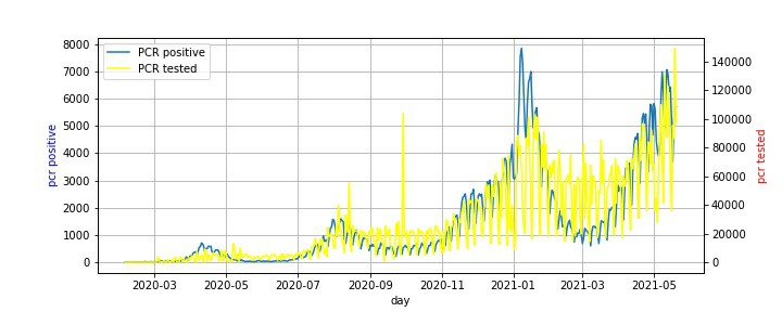
ほぼ重なってますかね。青い陽性者数が黄色い検査数を超えてきている1月過ぎは毎年ウィルス感染が増える時期です。陽性率も高いのでしょう。
検査数を増やせば陽性者数も増える。年中いるようなウィルスなんじゃないですかね。風邪は全員が年に2,3度感染しているそうですが、そのうち約15%がコロナウィルスだったかな。検査数の3%~10%ぐらいが陽性として表れるのをワーワー騒いでるだけではないかと。
年間の肺炎による死亡者10万人のうち1~2万人はコロナウィルスによるものなのかも。今回の過剰な騒動で肺炎の内訳として元々あったコロナを別で取り出した為に、2020年の肺炎志望者数が1万人以上減った。そして新たにコロナ死亡者が「作られた」。
【参考リンク】
【追記】続きで陽性者数と死亡者数のグラフも作ってみた。
以上です。